BMO Harris Bank
Brand Guidelines
Branding / Look and Feel / Guidelines / Design / Photo Direction
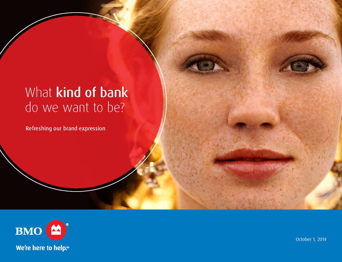
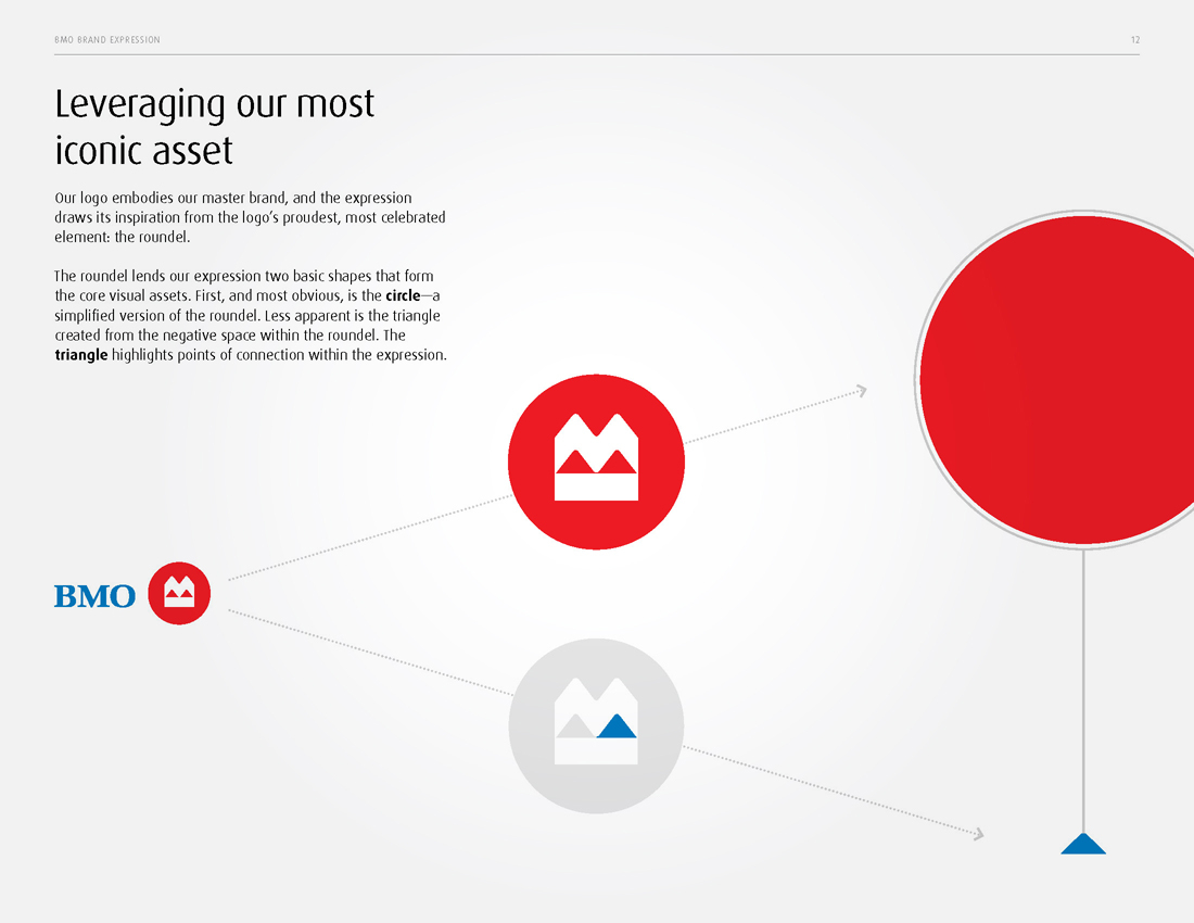
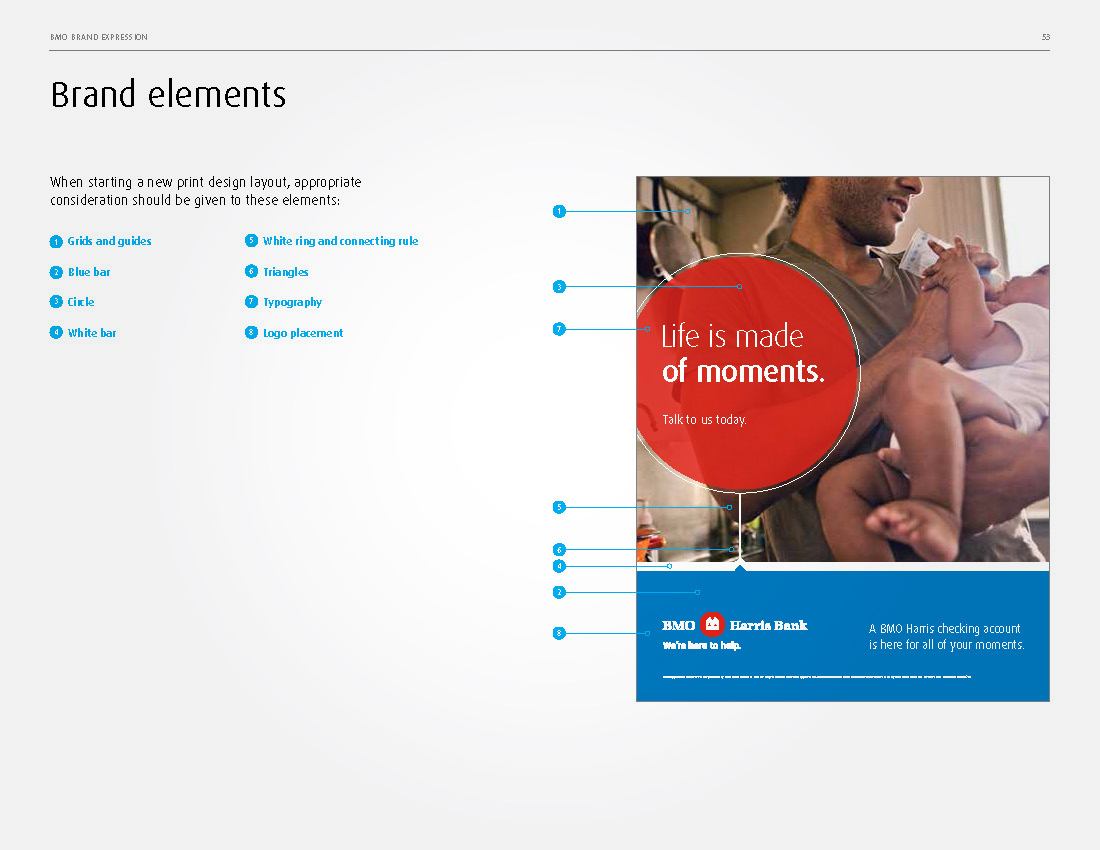
BMO came to us for help with updating their brand look and feel. They wanted to connect with their customers on a human level and dispel the notion that a bank is a cold, unapproachable institution full of confusing products designed for rigid consumer profiles. In short, they wanted to let the world know that they were here to help. We created a brand that focuses heavily on life's moments, using the BMO red ball logo as a device to highlight relatable, human moments and a voice that is unique to banking in it's honesty and candidness.







Agency: VSA Partners